Wednesday, May 23, 2007

TITLE SEQUENCES (cont.)

Continuing to research about title sequence, I also found two video clip called "25 of the best title sequences" part 1 and part 2. These 2 parts contain some of title sequences that I introduced in previous entry. Enjoy <(^o^)>


25 of the best title sequences part 1
25 of the best title sequences part 2

TITLE SEQUENCES

As the final assignment is aboout making a opening title sequence for a movie, I found some title sequences that interested me a lot. These title sequences are from movies which might be familiar to us. I hope you guys like them too.


PRIDE AND PREJUDICE

CATCH ME IF YOU CAN

HOSTAGE

Links : http://www.youtube.com/watch?v=aMXSXTo0yhA

http://www.youtube.com/watch?v=axloQEv6ksc

http://www.youtube.com/watch?v=JHuHoL1zdKQ

Sunday, May 20, 2007

MAKING A PHOTO LOOK LIKE PAINTING


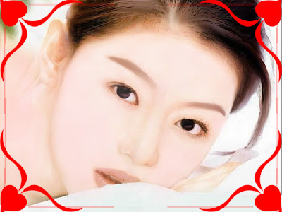
Original image


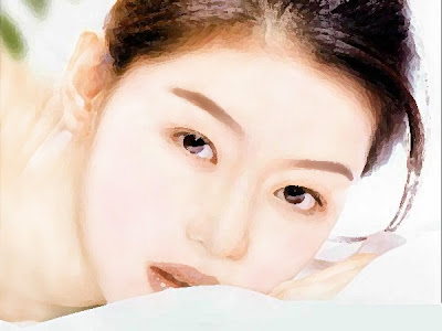
...After retouching


It is not too difficult to make a photo look like painting, but it requires a little patience.


  1. First, I used Dodge tool with exposure = 20% to take out all the dark area in the face.

  2. Next step is drawing eyebrows by using Smudge tool with strength =30%

  3. Make a new layer, used Brush tool and color= #fdd7d7 to make up the face a little rosy.

  4. Filter -> Artistic -> Dry brush ( Brush size =1, brush detail =10, texture=1)


5. Again, I used Smudge tool with strength = 30% to smoother the skin, eyebrows, eyelashes, lip... a little patience and I've got the image above.


Saturday, May 05, 2007

SOCIAL WELFARE POSTER


This is my work for Asignment 2B_Social Welfare Poster. My idea is about violence in family. In order to finish this, I took a pic of my sister and then used photoshop to edit it. Feel free to leave your comment.


Wednesday, April 25, 2007

FRUTIGER FONT


Frutiger font is designed by Adrian Frutiger, a Swiss type designer. This font was created due to the fact that the Charles De Gaulle International Airport in France needed a new typeface for directional signs.

Features:
  • Legible and distinctive
  • Easy to read in poor light conditions or far distance
  • Easy to recognized in various angles, distance especially the quick movement of passengers at the airport.

In addition to Frutiger font, Adrian Frutiger is famous for Univers, Didot, Avenir and Egyptienne


Links: http://www.linotype.com/281/frutiger.html
http://en.wikipedia.org/wiki/Adrian_Frutiger

Wednesday, April 18, 2007

SELF PORTRAIT MACHINE

CHARITY CLUB LOGO

This is a logo I tried to make for RMIT Charity Club. First off all, a group of students want to create a new club in school and called it "Charity Club". Therefor, I made this logo based on the purpose of the club : doing charity works. However, due to the small size of the club, they decided to change the name into "Charity Team". With the new name, I don't know how to change the logo. As you can see, I combined 3 red hearts to make them look like the shape of letter "C" which is the first letter of "Charity" and the black "C" is abbreviation of "Club". The problem here is that changing "C" into "T" but still keeping 3 hearts and the circle below. Pls give me some advises.