Monday, May 28, 2007

CARNIVAL OF SOULS


For my final assingment, I chose Carnivals of Souls to make title sequences. I want to introduce some of my researches about this fillm as well as its plot. Carnival of Souls was a horror film which is directed by Herk Harvey. The film opens with a car race between one car filled with guys and the other filled with 3 girls. The race ends when the girls' car falls down and disappears into the river below of a bridge. Mary Henry (Hilligoss) is the only survivor after many attempts to find the car. After that, she accepts a job as a church organist and moves to Salt Lake City. The horror moment of the film really begins when she looks out her car window while driving on a dark highway and sees a white figure of man appeared outside the window. After that, she recognizes that figure follows her to everywhere. At some moment, it seems that she becomes visible and audible to everyone around her. Then she puts attention to an abandoned carnival on the town and sees a lot of ghouls. The film ends at the scene where people find the car which is plunged into the river with 3 victims. The ending may be no surprise and it is like a dream occured during the whole film with frightend images.


Stars: Candace Hilligoss, Sidney Berger, Art Ellison, Stan Levitt, Frances Feist
Director: Herk Harvey
Writer : John Clifford
Released year: 1962


Wednesday, May 23, 2007

TITLE SEQUENCES (cont.)

Continuing to research about title sequence, I also found two video clip called "25 of the best title sequences" part 1 and part 2. These 2 parts contain some of title sequences that I introduced in previous entry. Enjoy <(^o^)>


25 of the best title sequences part 1
25 of the best title sequences part 2

TITLE SEQUENCES

As the final assignment is aboout making a opening title sequence for a movie, I found some title sequences that interested me a lot. These title sequences are from movies which might be familiar to us. I hope you guys like them too.


PRIDE AND PREJUDICE

CATCH ME IF YOU CAN

HOSTAGE

Links : http://www.youtube.com/watch?v=aMXSXTo0yhA

http://www.youtube.com/watch?v=axloQEv6ksc

http://www.youtube.com/watch?v=JHuHoL1zdKQ

Sunday, May 20, 2007

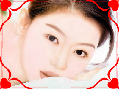
MAKING A PHOTO LOOK LIKE PAINTING


Original image


...After retouching


It is not too difficult to make a photo look like painting, but it requires a little patience.


  1. First, I used Dodge tool with exposure = 20% to take out all the dark area in the face.

  2. Next step is drawing eyebrows by using Smudge tool with strength =30%

  3. Make a new layer, used Brush tool and color= #fdd7d7 to make up the face a little rosy.

  4. Filter -> Artistic -> Dry brush ( Brush size =1, brush detail =10, texture=1)


5. Again, I used Smudge tool with strength = 30% to smoother the skin, eyebrows, eyelashes, lip... a little patience and I've got the image above.


Saturday, May 05, 2007

SOCIAL WELFARE POSTER


This is my work for Asignment 2B_Social Welfare Poster. My idea is about violence in family. In order to finish this, I took a pic of my sister and then used photoshop to edit it. Feel free to leave your comment.


Wednesday, April 25, 2007

FRUTIGER FONT


Frutiger font is designed by Adrian Frutiger, a Swiss type designer. This font was created due to the fact that the Charles De Gaulle International Airport in France needed a new typeface for directional signs.

Features:
  • Legible and distinctive
  • Easy to read in poor light conditions or far distance
  • Easy to recognized in various angles, distance especially the quick movement of passengers at the airport.

In addition to Frutiger font, Adrian Frutiger is famous for Univers, Didot, Avenir and Egyptienne


Links: http://www.linotype.com/281/frutiger.html
http://en.wikipedia.org/wiki/Adrian_Frutiger

Wednesday, April 18, 2007

SELF PORTRAIT MACHINE

CHARITY CLUB LOGO

This is a logo I tried to make for RMIT Charity Club. First off all, a group of students want to create a new club in school and called it "Charity Club". Therefor, I made this logo based on the purpose of the club : doing charity works. However, due to the small size of the club, they decided to change the name into "Charity Team". With the new name, I don't know how to change the logo. As you can see, I combined 3 red hearts to make them look like the shape of letter "C" which is the first letter of "Charity" and the black "C" is abbreviation of "Club". The problem here is that changing "C" into "T" but still keeping 3 hearts and the circle below. Pls give me some advises.


Wednesday, April 11, 2007

FONT EXERCISE

This is my font exercise. I chose Birch Std for the first picture and DT-Bahamas for the second one.


Tuesday, April 10, 2007

TYPOGRAPHY POSTERS WITH PHILIPPE APELOIG

6 posters below are designed by Philippe Apeloig. He is a French designer and very interested in typography. Also, he is fascinated in combining shape, image and meaning. In all of his works, he pays a lot of attentions to create forms from texts and contents. For example, he designed the 6th poster for Louvre Museum on the occasion of 10 years of the Pyramid of Louvre. Apeloig arranged the texts so that they looked like the real pyramid shape of the architecture. Here is his personal website : www.apeloig.com


Saturday, March 31, 2007

ORCHID CARD EXERCISE


This is my work for orchid card exercise. Pls leave some comments.

Tuesday, March 27, 2007

THE SWIRL OF KAO LEE THAO

I happened to read an interview with illustrator/animator Kao Lee Thao at http://www.amateurillustrator.com. She said that the swirl resonates in most of her works because according to her, "the swirl is a symbol of proportional perfection...". Her works looks refreshing and delicate. Link to the interview and images: http://www.amateurillustrator.com/articles/?p=555


Saturday, March 24, 2007

ILLUSTRATION ART OF NIK AINLEY

Nik Ainley - an UK graphic designer, passion for creating digital art illustrations. Among his works, I like the way he combined typography and illustration. His typography and the use of color are so imaginative, giving out the sense of motion. Check out his beautiful works at : http://www.shinybinary.com/


Wednesday, March 21, 2007

GESTALT EXERCISE


I created this based on closure concept

Sunday, March 18, 2007

2007 LOGO TREND

I found a website about logo design and came across with an interesting artile : “2007 Logo Design Trends -11 Trends that will define logo design in 2007”. The authors draw out 11 special styles that they think will be a tendency in logo design 2007. For instance, using talk boxes, people are effective ways to symbolize communication between company and customers as well as to illustrate the idea of importance of contact. The articles also gave out some explanations about each style. Interesting article! Take a look :D


1. Talk Boxes


2. Clouds


3. Reflections


4. Rectangle


5. 3d Puffies


6. Hot Dogs


7. Transmission beam


8. People


9. Transparency


10. Outlines


11. Punctuation


Link : http://www.logoorange.com/logo-design.php

Thursday, March 15, 2007

Sun & Moon in Indian myth - researching


  • Surya -Sun God

In Indian and Hindu mythology, Surya was the sun god and described as a red man with three eyes and four arms. People believed that Surya could treat sick people and bring them fortune.


  • Chandra -Moon god:

Chandra, also was known as Soma, was the moon god in Indian belief. It is said that every night, Chandra rode a chariot pulled by ten white horses.


Links:

http://www.windows.ucar.edu/tour/link=/mythology/surya_sun.htm
http://www.webonautics.com/mythology/surya.html
http://en.wikipedia.org/wiki/Surya

http://www.windows.ucar.edu/tour/link=/mythology/soma_moon.html
http://en.wikipedia.org/wiki/Chandra